Dark and Light Mode: Leveraging CSS Color Scheme Preferences
Designing to work with a user's preferred interface theme
Designing to work with a user's preferred interface theme
I hope this doesn't surprise anyone out there, but people are opinionated. Honestly, when it comes to supporting light and dark device settings, I'm really opinionated. Supporting these interface themes are an excellent example of "meeting your users where they are". It shows that you respect their preferences. Maybe they are in a dark environment and do not want a bright screen, maybe a light theme is easier to discern given a user's sight limitations. Whatever the reasons, including this support should be part of your design system.
In order to show how easy it is to implement and (hopefully) better the web world, I'll take you through a how-to on what it takes to support this user-centric design concept.
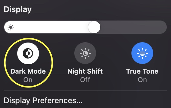
A user's interface theme is a system-level setting typically triggered by enabling "Dark Mode".
While this setting is most obviously apparent in the UI of your device, it can also be a signal to websites to indicate your preferred mode.
If you have an existing design system, it can be tricky to incorporate theme preferences, but not impossible, though you do need to make sure the design system (and team) is comfortable with allowing users to make their own design decisions.
Here are a couple items to consider:
As with many interface adjustments, switching modes leverages a media query:
@media (prefers-color-scheme: dark) { /* include dark-specific CSS here */ }
@media (prefers-color-scheme: light) { /* include light-specific CSS here */ }
Your media queries will work best when you leverage variables for your color palette. This will allow for overriding variables using higher specificity without needing to rebuild all the classes and rules within your CSS files.
:root { --text-color: #333; --background-color: #FFF; }
.my-component { color: var(--text-color); background: var(--background-color); }
@media (prefers-color-scheme: dark) { :root { --text-color: #FFF; --background-color: #333; } }
Just to put it out there, I'm not a CSS wizard, so I'm showing a pretty easy example. However, I have fully built support for Dark and Light modes into this site and it was not a difficult exercise.
My hope is that every site starts implementing this capability from the beginning.